PS5 Interface Presentation; Quicker, Better, but Not Perfect
An editor of Digital Foundry has prepared a short video, in which he presents and discusses PS5's system menu.

- PlayStation 5 will go on sale November 12, 2020.
- An editor working at Digital Foundry has prepared a video material that introduced us to the console's interface.
Sony did not revolutionize anything when designing PS5's interface. The menu we will be using should be treated more like an evolution of the path that was taken during the creation of the PS4. John Linneman from Digital Foundry has prepared a dozen or so minutes of video that guides us through PS5's system.
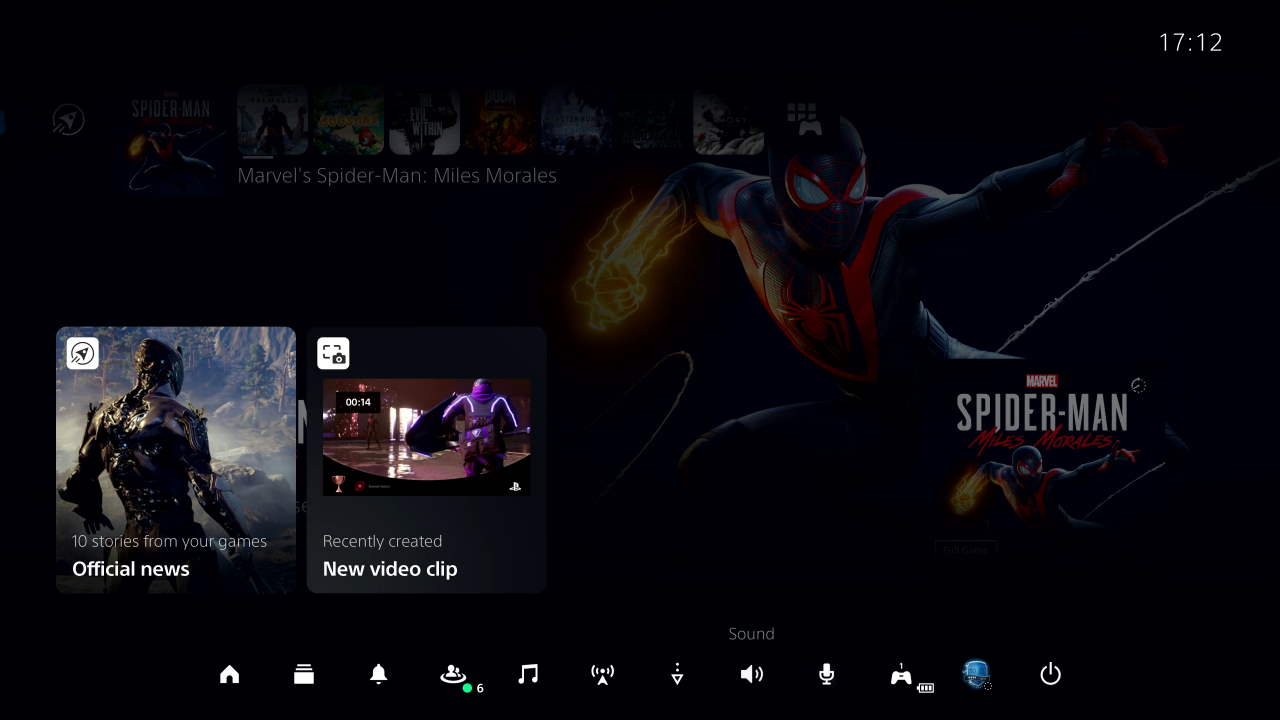
Despite the use of a tile system similar to the PS4, the differences are noticeable immediately. The game icons were moved to the top system bar. When we hold down the PlayStation button on the DualSense controller, a quick access menu will appear (which we can customise according to our preferences).
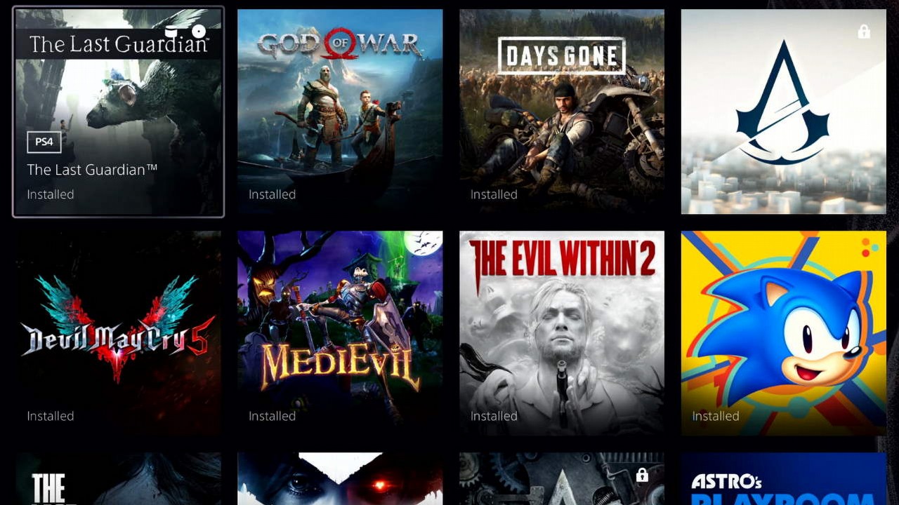
The improved operation of the game library also draws attention. Titles from PlayStation 4 are marked with an appropriate icon, we can select the sorting and filtering of the displayed titles. The whole thing runs very smoothly despite numerous games in Digital Foundry editor's library.

Unfortunately, we can also see some shortcomings. We won't be able to transfer PlayStation 5 games and saved game data to an external drive yet. If we want to back up our saves, we need to use the cloud in our PlayStation Plus subscription. The lack of folders may not be a problem at first, but over time and with the growing library of games installed, chaos will begin to creep in.
Sony will, of course, update PS5's system with new features, but once again after the release of the new console we are losing the capabilities that were available on older hardware.
- Twice the size of The Last of Us 2. Naughty Dog's new game is expected to shock with its scale and offer more RPG elements
- Sony teams up with Left 4 Dead creator on new 4-player cooperative shooter
- Assassin's Creed meets Avatar: The Last Airbender: The God Slayer looks like an incredible open-world action adventure RPG
0

Author: Paul Musiolik
Started writing about games on the SquareZone website. Later, he wrote and managed the non-existent PSSite.com, and currently runs his own blog about games. He hasn't yet written a text that he would be 100% satisfied with. He started his adventure with games at the age of 3, when he managed to convince his father to buy a C64 computer. The love for electronic entertainment awakened by Flimbo's Quest blossomed during the first adventures with Heroes of Might & Magic, reaching its peak after purchasing the first PlayStation. As he grew older, he had more encounters with Nintendo portable consoles, and also returned to the PC as an additional gaming platform. He collects games and is a fan of emulation.
Latest News
- End of remote work and 60 hours a week. Demo of Naughty Dog's new game was born amid a crunch atmosphere
- She's the new Lara Croft, but she still lives in fear. Trauma after Perfect Dark changed the actress' approach to the industry
- „A lot has become lost in translation.” Swen Vincke suggests that the scandal surrounding Divinity is a big misunderstanding
- Stuck in development limbo for years, ARK 2 is now planned for 2028
- Few people know about it, but it's an RPG mixing Dark Souls and NieR that has received excellent reviews on Steam, and its first DLC will be released soon

