Windows 10 Will Finally Get Rid of Windows 95 Era Icons
Microsoft's Windows 10 update 21H2 „Sun Valley” will refresh the look of the icons, which haven't changed much since Windows 95. The new icon design will be much more modern.
1

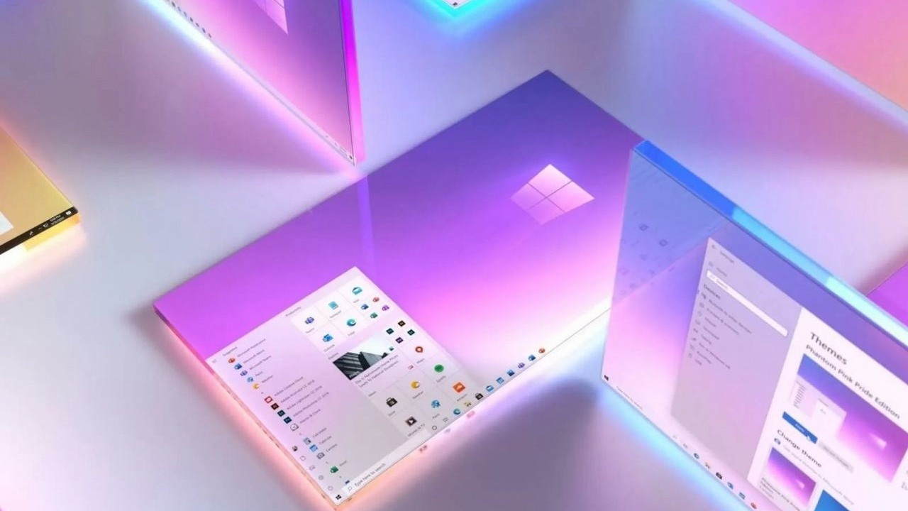
Windows 10 is expected to receive the 21H2 "Sun Valley" update in the fall. There's going to be a lot of visual changes and unification of the system's visual style. Microsoft is betting on a modern look, including "floating" start menu and rounded interface. Big changes are also waiting for folders in File Explorer. The folder will again be horizontal, there will be a lot of color and a simpler appearance, which should make it easier to distinguish the place where we keep our photos from the folder with documents. Disk and external media icons will be simplified and "straightened out".

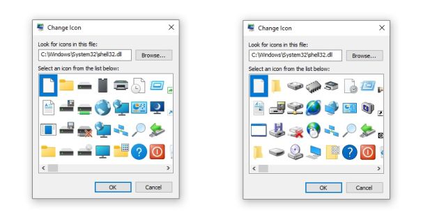
One of the priorities has been the consistency of appearance, therefore icons in shell32.dll, which have not been refreshed for a long time, presenting folders, disks or external media will be changed. The icons will finally be consistent with the rest of the system and will abandon the style that has accompanied them since Windows 95.
Not all users employ these icons and some may not have even been aware that they exist. Looking at their appearance so far, they've also been forgotten by Microsoft, which won't say goodbye to the 1990s until late 2021.
The biggest changes concern external drives and media, which got a much refreshed look. Some people may not like the size reduction of the icon (floppy or CD), which may make it less readable. The refresh of icons associated with the Internet, on the other hand, is welcome.
There are big changes coming, which, at least in theory, should improve the use of the system. New icons, however, will have to face up to our long-standing habits. We will find out who will win this clash in October or November, this year.
- Windows 10 Will Get a Major Icon Overhaul
- Windows 10 Update Will Add 'Floating' Start Menu and Rounded Edges
- Windows 10 - official website
1

Author: Konrad Sarzynski
He has enjoyed writing since childhood and always dreamed of writing his own book. He just never expected it to be a scientific monograph. He has PhD in urban studies, which he is happy to brag about to his friends at every possible opportunity. He started his adventure with Webedia in late 2020 in the Tech department. He created texts, ran the technology newsroom, and later co-founded Futurebeat.pl, being responsible for featured articles and hardware tests. Now he focuses on all kinds of builders - both mainstream and indie - which he streams on his Twitch channel. He lives with his cat and wife.
Latest News
- „They get more hate than they deserve.” Josef Fares comes to EA's defense and points the finger at Sony and Nintendo
- They used to ban them, now they make money on them. Rockstar opens Cfx Marketplace with paid and free mods
- „I don't get you guys”. New Tower mode in Diablo 4 divides players
- Euphoria didn't last long. „New” footprint of Prince of Persia: Sands of Time Remake turned out to be a painful return to the past
- „It's crazy that 50% of you are lying.” GTA 6 fans faced a tough choice: half would do it without hesitation

