The simplicity and rawness of artstyle. 6 things Diablo IV could learn from Diablo II

- 6 Things Diablo 4 Needs to Learn from Diablo 2
- Screw the kits
- Loot should not be "smart"
- A plot with understatement and a heavy tone
- Before venturing forth... a team of eight people must be assembled
- The simplicity and rawness of artstyle
- Bonus: things Diablo 2 Resurrected should improve
The simplicity and rawness of artstyle
We already know that Diablo 4 will be dark. We found out the hard way, that Diablo 3 was not dark. Conclusion? Diablo 4 is definitely going in the right direction. But I'm still not sure it's quite there.
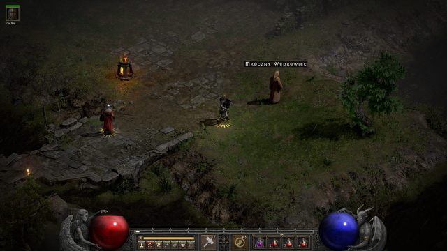
You see, the magic and charm of Diablo 2 is more than dark colors, lots of blood and some "sinful" sequences. There lurks an element that even the creators of such great mods to D2 as Median XL, which at one point went wild with glamour, forgot about. You see, the strength of Diablo 2lied as much in the choice of graphics and ornamentation as in... moderation. Frugality. The pure rawness of what we saw. Sure, it was partly due to the limitations of the hardware and the engine the game was built on, but Diablo 2 Resurrected showed that it was also a creative method.
When entering Sanctuary, we're not entering another Tolkien fantasy or one straight out of an Asian MMO (which someone forgot and I'm not going to point the finger at who anymore and on what occasion). Nope. We cross the threshold of a harsh, gothic land where the apocalypse has swept through. A land of decaying ruins and crumbling walls. The rotten, desolate jungle and the harsh, barren wilderness. We pass by demolished houses, monasteries or suburbs. Even the angelic habitat in the fourth act, Fortress of Pandemonium, looked like a utilitarian building rather than an ornament.
I'm afraid Diablo 4 will forget the power of simplicity and rawness. That it will be dark, bloody and brutal, but overloaded when it comes to location designs or even HUD. After all, in Diablo 2 it all looked simple and chiseled from stone – so even getting stuck in inventory menus didn't spoil the atmosphere. Can Blizzard still exercise true restraint, or will they overdo the glamour here and there?


