The atmosphere of horror. What made BioShock special? Here's 14 things
Table of Contents
This applies to the first BioShock, though similar conclusions can also be drawn about the subsequent installment and Infinite. None of these games, however, matched the atmosphere of horror that could be experienced in part one. Maybe it didn't make the game a full-fledged horror, but it definitely has the potential to raise your heart rate and make the hairs on the back of your neck stand up.
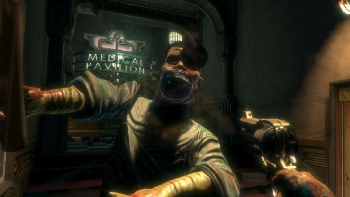
In my opinion, this is achieved with four main ingredients. Phenomenal lighting, blood (I'll explain in a moment), ambiguous plot and disturbing locations that tell their own – also full of horror – stories (great examples are the medical pavilion, where the mad plastic surgeon, doctor JS Steinman, is carying out his sick experiments trying to revolutionize his field of medicine, or the Sybarite Castle, in which we get to know the plot of an abominable artist, Sander Cohen). The latter two will be discussed later in the text, so let me now focus on the others.

The play of light and shadow used in the first BioShock performs a double function. On the one hand, it defines the aesthetics of the visited rooms – usually dark, causing at least moderate fear and giving the impression that something is constantly waiting for us around the corner. On the other hand, it's a kind of compass for the player. This is a simple, but extremely elegant and effective trick that was probably first used by Valve in Half-Life. The point is – some kind of visual element should always show the player the way forward. In the case of BioShock, it is light; if someone gets lost – despite the arrow pointing to the next target – they should follow the light.
Pools of blood have a relatively similar use. They very often indicate places where you can find something of interest. Their bright color, on the other hand, makes them contrast with the dark ambience of the game, making them extra visible. Needless to say, the blood splatters are disturbing themselves.


