Oscar-grade audiovisuals. What made BioShock special? Here's 14 things
Table of Contents
Finally, I there's seemingly the least important piece of the puzzle, which, however, ties everything together into a complete whole. The audiovisual setting of each BioShock can be safely described as a small work of art and it will not be an exaggeration. It is true that the graphics have aged a fair bit by now, but that's only true about the quality, rather than style – which is invariably up-to-date and adequate to the concept of the creators.
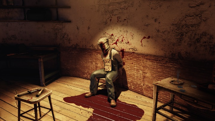
As I have already written a lot about the appearance of Rapture – neon lights, dark alleys, blood stains, play of light and shadow – I will discuss this issue on the example of Columbia. Besides, I promised that I would explain how BioShock Infinite got the label of overly brutal production. This was because the game by Irrational touches upon a few "Important Subjects" (such written in capital letters), and the floating city of Columbia is a very charming place, not really evocative of chopping off heads or tearing out the insides of another man with the Sky-hook. So, why all this violence?

Most significantly, this opinion was defended by both media and developers – including Cliff Bleszinski, who created/co-created games such as Unreal Tournament, Gears of War or Bulletstorm (usually violent, bloody shooters). Anyone who criticized BioShock Infinite for this didn't seem to notice the contrast on which this brutality was based. Fountains of blood made sense the sky-high, idealized city precisely because it revealed its true, anti-utopian face. They fit well within the story, because they didn't fit in the world.
Moreover, such expressive, grotesque violence adds credibility to the game. Because once we find out who Booker DeWitt really is, and how crazy he is, everything starts to form a coherent whole – splattered in blood red. This is further evidence that the BioShock series is story-oriented. As Ken Levine said in relation to the first edition: "[...] it was the story, rather than a map, that gave direction to what had to be shown."


