Fresh Graphics From Warcraft 3 Reforged; It's Almost Perfect
New campaign shots, character portraits, loading screens, battlefield backgrounds and menu screenshots from the beta version - all published on Wowhead by Blizzard's employee Anshlun. Warcraft III Reforged will look worthy, but Blizzard has once again made a mistake.
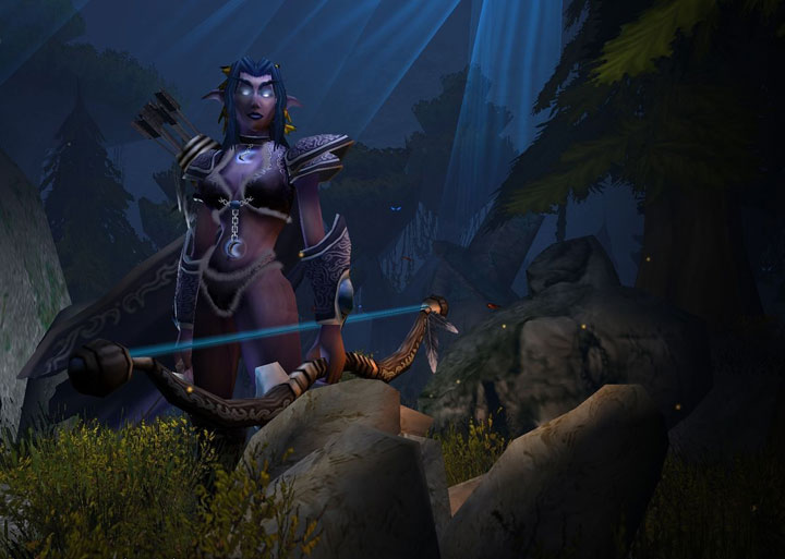
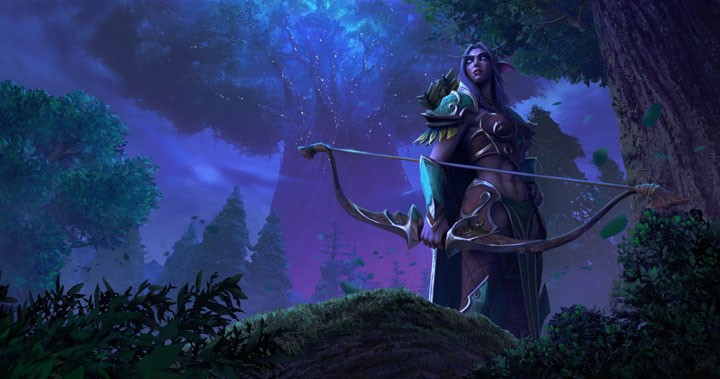
Anshlun, an official representative of Blizzard, has uploaded some graphics to Wowhead that herald the upcoming refreshed version of the company's iconic RPG / strategy game - Warcraft III Reforged. The first official announcements appeared almost a year ago on the infamous BlizzCon 2018. On the shared materials we can see different shots from the main menu or loading screens and character portraits. The first to appear are selected units with their own backgrounds, which can also be associated with the original version: a foot soldier in front of the castle gate, a thrall in an orc camp or an elven archer among the trees of Brokil... I mean Ashenvale:
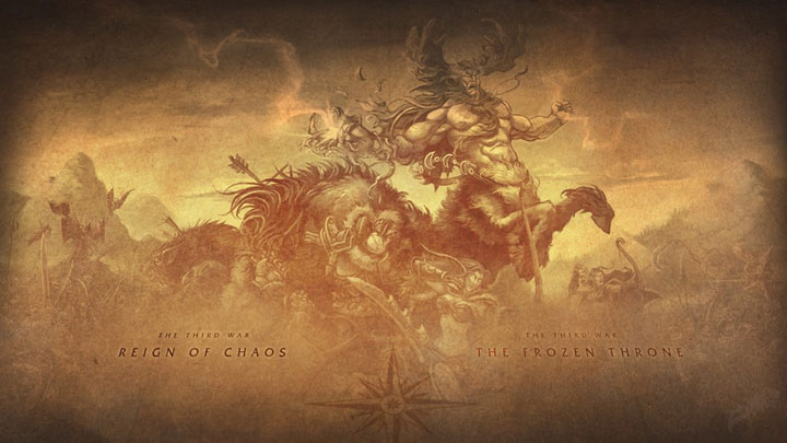
Campaign loading screens were also presented, showing the map of Azeroth with the visible lands of the Eastern Kingdoms, Kalimdor and Northrend, which are the setting of Warcraft 3. Together with them, a drawing with the fearsome Malfurion Stormrage was presented.
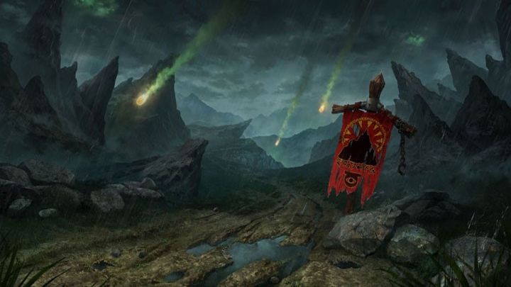
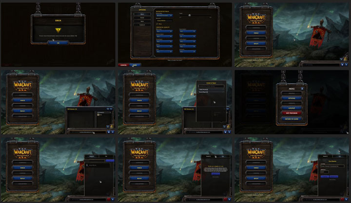
A lot of space was devoted to screenshots (published by Anshlun in a separate post). These graphics show us mainly the menu, i.e. how the game will look like when selecting factions, gameplay options or scenarios. Here, the greatest improvement can be seen in the very background with the Horde flag embedded in the wastelands destroyed by the Legion's meteors. The interface elements were also subject to refurbishing, but they looked very good already in the original version.
Character portraits deserve special attention: at first glance you can see how much time has been devoted to each model. Patterns and wear on armour and materials, fabric textures, single strands in beard or hair, pimples on the faces, the play of shadows.... There is definitely something to rest your eyes on, although it is possible that in the game itself it will not be so visible because of the much smaller size of the images in the interface. Below we present the faces of selected heroes and units from Wowhead:
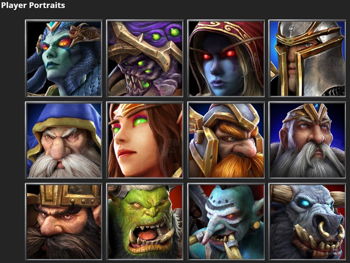
Many different character portraits in the original Warcraft III are presented, but certainly not all of them. We'll have to wait a bit longer to see those assets in their full glory.
Whose background is this, actually?
As with Blizzard's last case, the company couldn't do without a slip-up. The above assets are generally accepted as official Blizzard graphics, but one of the Wowhead forum members noted that some of those elements... his work. He also noted that none of the Warcraft creators had contacted him on this matter. It's mainly about two graphics - Thrall against the background of Orgrimmar, the capital of orcs known for World of Warcraft, and Anub'arak against the background of Tirisfal Glades, the former power of Lordaeron, now cursed by the undead. Below you can see the comparison:
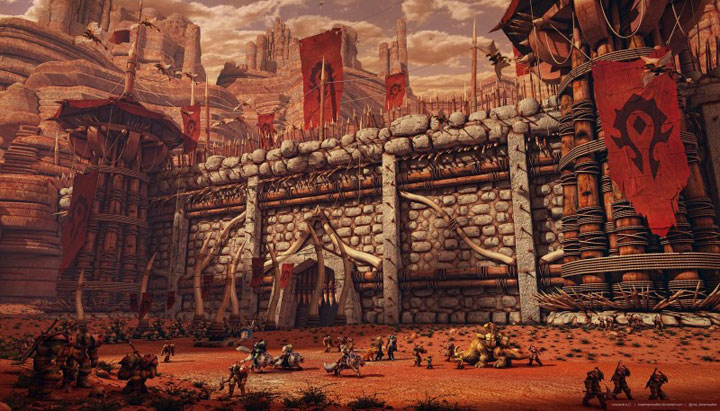
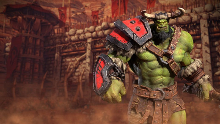
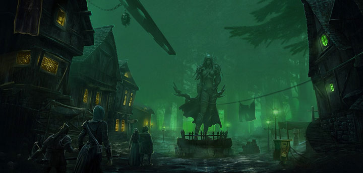
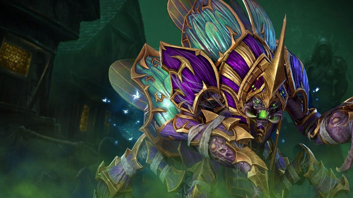
Yeah, you are seeing this right. Blizzard used fan graphics to create official assets to promote their title. The Orgrimmar shot comes from deviantart and Tirisfal Glades from Reddit. Even if the intention of the studio was to show respect for the community of faithful fans, it would be decent from the company to at least give the credit where it is due. In the case of the second set the matter would be a bit more complicated, as the author of the graphic design used another one, coming from the game Lord of the Rings: War in the North. There are also voices accusing Blizzard of ordinary laziness. We look forward to hearing from you about these materials.
Warcraft III Reforged will be released later this year. For the Horde!
0
Latest News
- End of remote work and 60 hours a week. Demo of Naughty Dog's new game was born amid a crunch atmosphere
- She's the new Lara Croft, but she still lives in fear. Trauma after Perfect Dark changed the actress' approach to the industry
- „A lot has become lost in translation.” Swen Vincke suggests that the scandal surrounding Divinity is a big misunderstanding
- Stuck in development limbo for years, ARK 2 is now planned for 2028
- Few people know about it, but it's an RPG mixing Dark Souls and NieR that has received excellent reviews on Steam, and its first DLC will be released soon
