Players Think CoH3 is Ugly; We Compare It With Previous Installments
Since January 11, all gamers have had the opportunity to pre-test Company of Heroes 3. Unfortunately, not everyone is thrilled with the current look of Relic Entertainment's game.
1
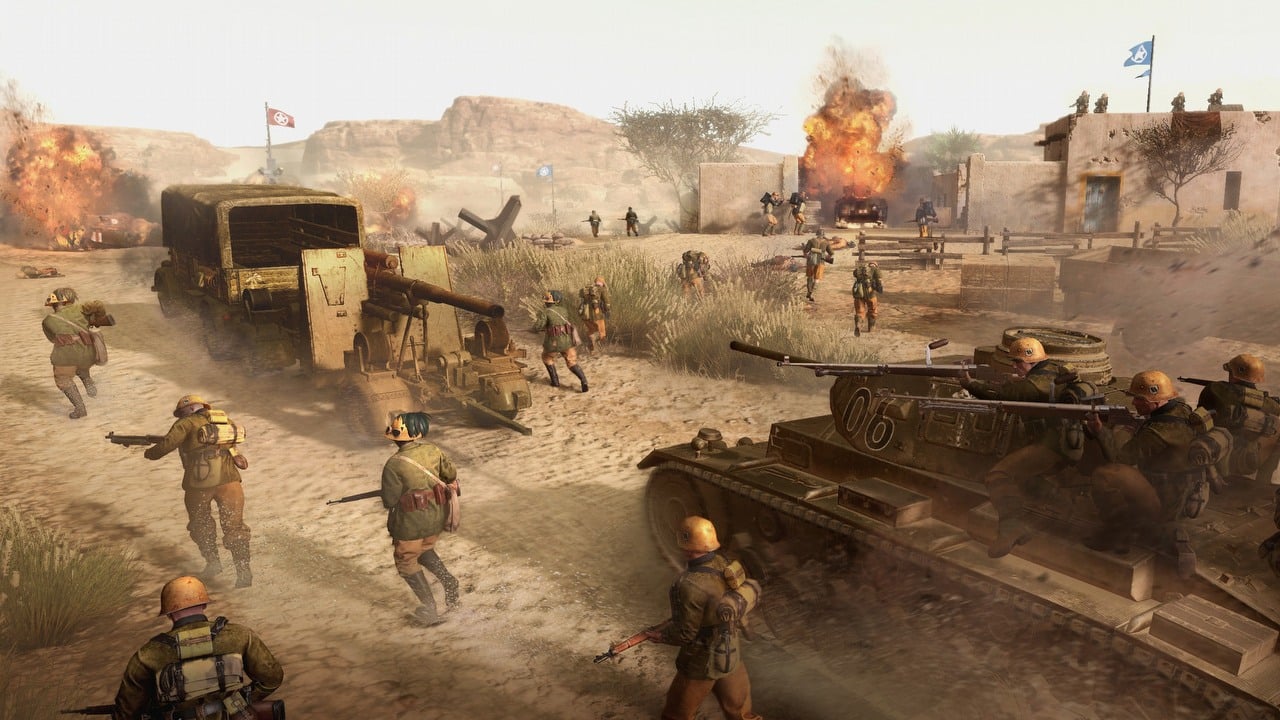
The release f Company of Heroes 3 is fast approaching. The real-time strategy, whose previous two installments won the hearts of quite a large group of players, is eagerly awaited by those who enjoy classic RTS games. It's hardly surprising, by the way - the second installment debuted in 2013, so a lot of water has passed under the bridge since then.
Fortunately, for those who can't wait for the February release of CoH3, open testing of the multiplayer mode has been organized. This is, of course, a great opportunity - just over a month before the game's debut - to see for yourself how much progress the devs at Relic Entertainment have made compared to previous titles. The problem, however, is that, in the minds of a considerable number of players... they haven't. In the series' fan community there have been quite a few threads about the ugly graphics in Company of Heroes 3.
Disgruntled users continuously list - in their opinion - the flaws of the upcoming RTS. Particularly criticized are the unnaturally faded, cartoonish maps.. Among the comments there is even a comparison of CoH3 to Team Fortress 2. Intense lighting is somewhat offset (although not in everyone's opinion) by setting the screen brightness within 10%.
You can read some selected comments below.
"It [the graphics - editor's note] looks really bizarre. They are somehow bleached, but also cartoonish. The explosions are hopeless. Vehicles immediately turn into piles of ash in super poor animation. Airplanes look like they animated a small child playing with a model on the screen. The menus are worse than those in Age of Empires 2, a game from 1999.
It's unbelievable that this is basically the final product. It's so bad it's unreal," complains cosmonaut_hurlant_
"It looks like Team Fortress 2 or something like that. Everything is so bright and faded, and at the same time it looks like some weird modern cartoon...," points out DatSass
"Looks like a mobile game from 2010," summarized MrTornnado.
"I tried with lowering the brightness and noticed a significant difference from the default settings from this thread," reports whispa07
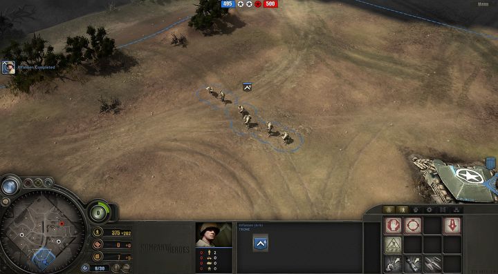
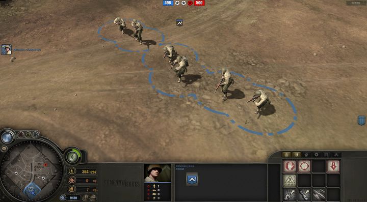
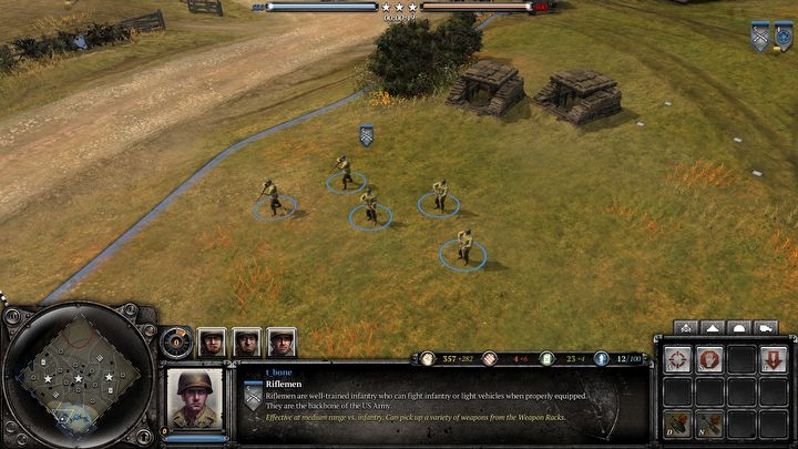
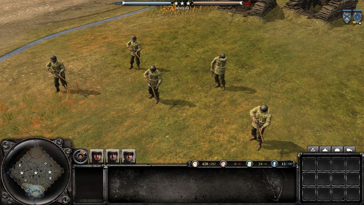
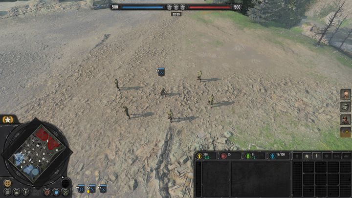
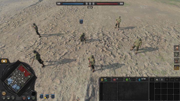
To give you a better insight, and to be able to judge the supposedly cartoonish visuals for yourself, here are sample graphics from CoH3, juxtaposed with previous installments.
Company of Heroes
Company of Heroes 2
Company of Heroes 3
As a final reminder Company of Heroes 3 will debut on PC on February 23, 2023. Sometime after the PC release, the game will also appear on PS5 and XSX/S.
1

Author: Kamil Kleszyk
At Gamepressure.com deals with various jobs. So you can expect from him both news about the farming simulator and a text about the impact of Johnny Depp's trial on the future of Pirates of the Caribbean. Introvert by vocation. Since childhood, he felt a closer connection to humanities than to exact sciences. When after years of learning came a time of stagnation, he preferred to call it his "search for a life purpose." In the end, he decided to fight for a better future, which led him to the place where he is today.
Latest News
- This is expected to be the biggest year in the company's history. Blizzard prepares an offensive that will overshadow previous years
- Bethesda envied CD Projekt RED? Starfield may undergo a Cyberpunk 2077-style metamorphosis
- Season 2 has just started, and Todd Howard is already writing the script for the third one. Fallout 5 will be changed by the TV show
- 5 games to grab on Amazon Prime Gaming. Among them, a collection of RPG classics
- My experience attending the 2025 Game Awards, and why I loved it
