Challenges in LoL are Not What Players Wanted
Challenges in LoL are not to the liking of players. The idea itself is praised, but its implementation in the client leaves much to be desired.

Quite a lot has been going on in League of Legends lately. In addition to the ongoing Mid-Season Invitational 2022. this week the game received a patch that introduced a new tab to the client with challenges. While the idea itself seems quite interesting, the players are not entirely happy with the implementation.
What are the challenges?
In patch 12.9 Riot Games implemented Challenges into the game. As we can read in the patch notes, which can be found on the official website of League of Legends they are supposed to track the progress of players in many ways.
They concern both the heroes we choose during the game, our actions and the items that we accumulate in the account. If you have not yet had a chance to familiarize yourself with how the challenges work in the game itself, Riot Games has also created a detailed guide to the new tab, which you can find here.
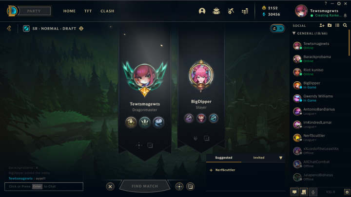
Finally, on the subject of challenges, we should mention that they also appear on the player's profile - both the main one and in the waiting room. The same is true about the title, which we earn for completing tasks. It, too, is visible in the aforementioned places.
These challenges are so... mediocre
It is known that changes are not something that comes easily, which we will be able to see especially in the moment, when patch 12.10 will be released (more about it here). But back to the challenges, players generally like the idea, but it also has its drawbacks.
"[...] Overall I think challenges are a fine addition to have. But god were they implemented badly.. The entire system is confusing. How to make progress and where to find certain challenges isn't clear. The titles and icons that say "compleye challenges from x category" are entirely unhelpful because then you need to go back to the challenges tab to find said category. [...], wrote ultratea.

"It's also a matter of accessibility in UI. It doesn't make sense that the role picker is the smallest part in there when it's the important thing you need to click in order to queue up. The ideas aren't bad but they don't feel polished, more like just threw them on the client and forgot about sizing and usability in the existing UI," wrote LatteAD.
"Who in the right mind thought it would be good idea to shove the challenges into our face instead of the scoreboard at the end game screen... What the hell people," wrote NocaNoha.
Dear Riot Games, you can fix this!
Player criticism is mostly constructive, and problems such as the unclear UI sound rather serious. There is still some time until the next patch, so there is a chance that Riot Games - receiving feedback from the community - will improve what is necessary and the challenges will no longer irritate the community (or at least to a lesser extent).
0
Latest News
- End of remote work and 60 hours a week. Demo of Naughty Dog's new game was born amid a crunch atmosphere
- She's the new Lara Croft, but she still lives in fear. Trauma after Perfect Dark changed the actress' approach to the industry
- „A lot has become lost in translation.” Swen Vincke suggests that the scandal surrounding Divinity is a big misunderstanding
- Stuck in development limbo for years, ARK 2 is now planned for 2028
- Few people know about it, but it's an RPG mixing Dark Souls and NieR that has received excellent reviews on Steam, and its first DLC will be released soon


