Age of Empires 4 Takes Flak for Visuals, Devs Respond
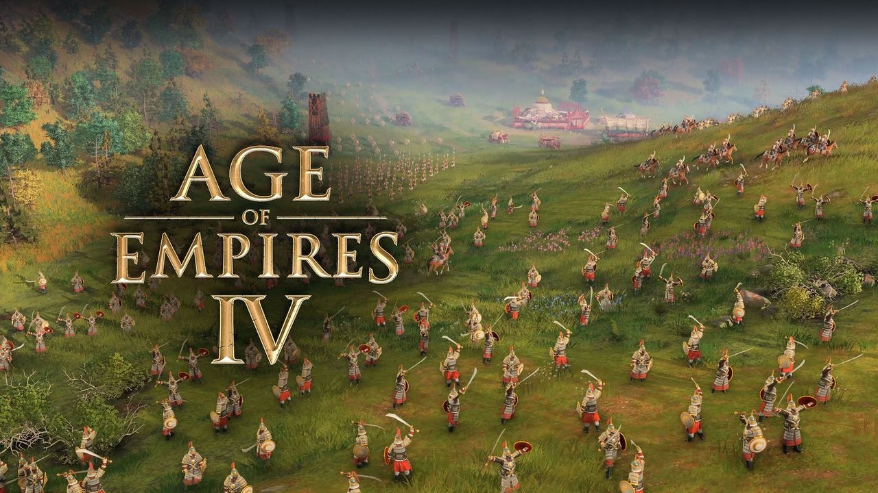
Part of the Age of Empires 4 community is not happy with the artistic direction taken by the developers. According to these fans, the graphics are far too colorful and exaggerated. The developers defend their decision by citing several arguments.

IN A NUTSHELL:
- Some players feel that the visuals of Age of Empires IV are far too colorful;
- According to the developers, it's a matter of readability and the character of the series, but these arguments are do not convince everyone.
Fans of the Age of Empires series are slowly gearing up for the release of its highly anticipated fourth installment, which is due later this year. However, not everything associated with the game is appreciated by the community. One of the issues that raises the greatest doubts and controversy (e.g. on Reddit) is the graphics, which ,according to some people, is far too sugary.
"So, why does the units look like they're made out of clay? and why do the arrows look like over-sized spears ignoring the laws of physics? Compared with the content of the new trailer of AoE2 DE looks like the newer game," notes teethLessSanta.
"I really hope they will change the cartoonish graphics. Looks too much like a casual mobile game than a serious RTS game," nikkythegreat agrees.
Readability, but is it in line with the spirit of Age of Empires?
The developers defend their approach by saying that the visuals need to be easy to read so that players have a good understanding of what's going on on screen.
“We do things to help the players recognise units much more quickly, like enlarging the weapons, making the colours more differentiated against the environment… and making sure there’s a consistent footprint between each civilisation [and] between each building function. Readability and playability are top on our list in terms of the visual direction, and making sure that it is as welcoming as possible to the experienced players and also to new players," said the game's creative director, Zach Schläppi (via PCGamesN), during a Q&A session.
Not everyone agrees with this point of view - some users point out that there's no shortage of game that are very much playable, despite the fact that their developers decided to use very realistic graphics. A great example here may be SpellForce 3 or Manor Lords, but the entries also include older titles.
"Company of Heroes 1 and 2 both look really good and have held up. I think it should be possible to make a similarly good looking game with medival warfare. For that reason I hope the graphics will be heavily revised," - AltesTestament notes.
But maybe AoE4's art style is simply the result of the developers' vision. In a recent edition of the XboxEra podcast, World's Edge creative director Adam Isgreen argued that the original creators of the Age of Empires series (Ensemble Studios) wanted to deliver a “bright and inviting world”.
0
Latest News
- 12 million players are celebrating, but not everyone will get a gift. ARC Raiders devs give away pickaxes and bans
- Cyberpunk 2077 creator explains why male V suddenly disappeared from ads
- Court sides with GTA 6 devs. Former Rockstar Games employees suffer a painful blow in their fight for money
- 2 Xbox Game Pass games. Star Wars: Outlaws comes with a newly released zombie apocalypse simulator
- „Bloodborne is a special game for me.” Dark Souls father's honest declaration is painful and hopeless, but true


