The Witcher 3 had bad inventory? Hold my beer!. The Witcher 3 Elements That Didn't Work in Cyberpunk 2077

- The Witcher 3 Elements That Didn't Work in Cyberpunk 2077
- Empty collectibles
- Actual notes in 2077? Really?
- Gwent 2077 is still missing
- The Witcher 3 had bad inventory? Hold my beer!
The Witcher 3 had bad inventory? Hold my beer!
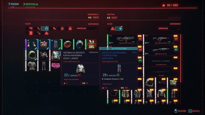
Finally, there's the inventory, very similar in both productions. This example seems interesting because the item management in The Witcher 3 was quite average – and before players' feedback was listened to, it was even worse. Unintuitive interface, too small capacity, no separate tabs for potions utensils... Should I go on? In Cyberpunk 2077 we got a corrected version, which, however, had its own problems.
Some of them were caused by the chaos resulting from the presence of cyber implants and related improvements. Enough is enough isn't a motto often head in CDPR, apparently. CD Projekt treated us with colorful items – blue (rare), purple (epic), yellow (legendary) and so on. What's more, there were situations when we found two things that were identical visually, but significantly different in statistics. Geralt could at least confidently use unique elements of the witcher's gear. V has no such possibility, because even some legendary items have regular versions.
So, in the end, we had to learn to manage a huge trash can. Fortunately, the equipment can be upgraded, so you don't have to necessarily juggle items every hour or two. However, I am convinced that this was not the assumption of the creators – not in Night City, where fashion and style define existence. But try staying stylish – especially when playing on the hardest difficulty – when uglier items have better stats.
Okay, how could it be done better? I think an interesting solution would be to remove all these colors, limit the loot dropping from opponents and make the identical items be at the same level, while putting more emphasis on improving them. This would allow you to choose your own gear and then make it powerful. A bit like in the Souls series, where the collected items really have some value.


