PS5's UI – an interface that we know well. PS5 review. A promise of a better tomorrow?

- PS5 Review - A Promise of a Better Tomorrow
- PS5 is powerful?
- SSD in PS5 – welcome to the 21st century
- DualSense is cool, but...
- Is PS5 heating up? No! It is quiet and cold.
- PS5's UI – an interface that we know well
- PS5 – is it worth buying? Editorial opinion
PS5's UI – an interface that we know well
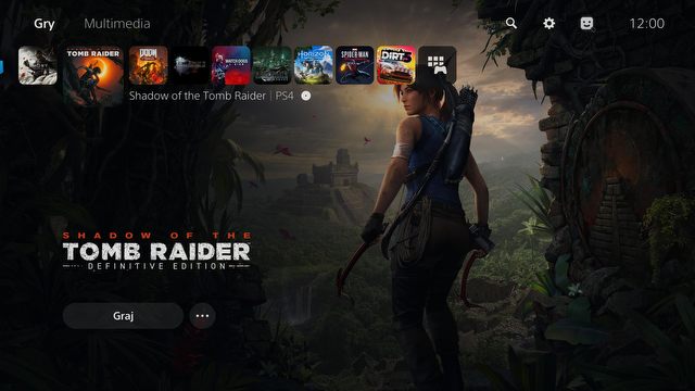
It is impossible to say too many new things about the user interface in PS5, simply because it's strikingly similar to the Dynamic Menu from the predecessors. It's based on two rows of icons: system options on top, access to store and apps at the bottom. The owners of the PS4 will feel at home, as most things are left as they were. But not everything.
The novelty is the addition of two sections on the top bar: "games" and "media". Unfortunately, before the release, the PS5 interface is not 100% complete, so I missed the opportunity to test the latter. I assume that it will contain links to quick launch applications such as Netflix or Spotify, so they will not mix with our favorite games. In a couple of days we will see how it works in practice, but the very idea of such a division seems to be the right one.
However, I'm going to make another change – on older consoles after pressing the PlayStation logo button the game was minimized and we moved to the main menu. Holding down the "PS Button" developed a quick menu where we had options to adjust the volume, turn off the console or launch the playlist on Spotify within one click. The fact how similar the Xbox interface has become to this one is the best proof of its quality.
Sony seemingly tried to improve something that already worked great and that may have not been the best idea. These changes require a change of habits, and as a lazybones, I do not like to be forced to do so. On PS5, a single press of the PlayStation logo will prompt a quick access bar on the bottom of the screen, and to launch the main menu, you have to hold it down. So the functionality of this button has been reversed – after a few dozen hours with the console, I still often get it wrong...
The second thing: although this "quick menu" can be more or less customized, the most frequently used functions, such as volume control or console shutdown, were moved to the very end of the list. I understand that these few extra clicks will not be a show stopper for anyone, but I also can't see the rationale behind it. Power options will be used by virtually every console user, as opposed to sharing screens or setting up a group chat, so they should have been placed more conveniently. For me, it's not an understandable choice.
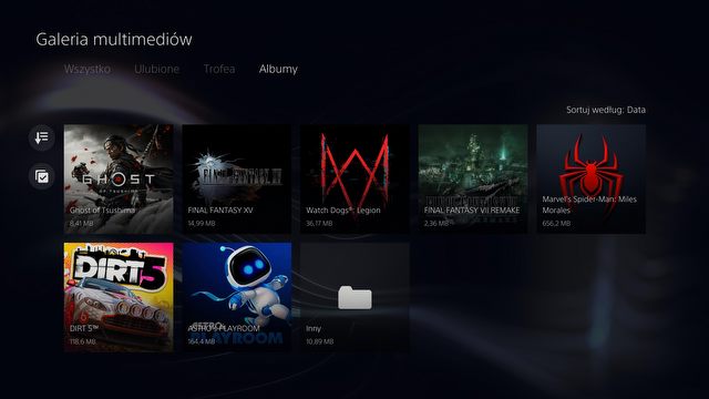
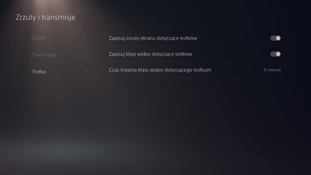
There was a slight change in the system of taking screenshots after getting an achievement. On PS4, it often happened that notification about them popped up on the screen during the cutscenes or when loading levels, so that our glorious screenshot was often a failure. The solution to this problem is obvious – who cares about screenshots from the moment of winning the trophy? I certainly don't, they only take up space on the console disk, and as I've already mentioned, every megabyte will count on the PS5. Sony, however, introduced a system in which a few seconds of the game is recorded while gaining achievements. This may seem like a nice gimmick for some.
But first of all, I still don't know why someone would want to do that. Secondly, I won 2594 trophies on PS4, which in practice means 2594 totally redundant screenshots, and on PS5 it will translate into 2594 videos a few seconds long each, thus occupying a substantial amount of space. Nonsense.
Fortunately, there are also some nice things. A system of built-in hints may be a godsend for some players. If you get stuck on some more difficult parts of the game, you don't have to go online to check a guide, because PS5 itself will show you the solution. It is quite brilliant.
