I Don’t Know What Capcom Is Trying to Do Here, but It Looks Bad. I Played Monster Hunter: Wilds
When preparing for a fair, developers usually choose the most spectacular and polished fragments of their game. Sadly, Capcom didn’t do that when presenting Monster Hunter: Wilds at gamescom…

I'm going to write briefly, because the demo provided at gamescom was short. Monster Hunter is not a game series that is suitable for fair shows - you have little time to present the game, people around are talking and moving, and the specificity of this production does not allow you to understand it without at least a few hours invested in it. So take this into account when reading these short impressions - I could base them on the game's superficiality, on how it presents itself. And unfortunately, it looks very bad.
Blurred, ugly, frivolous
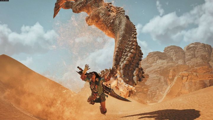
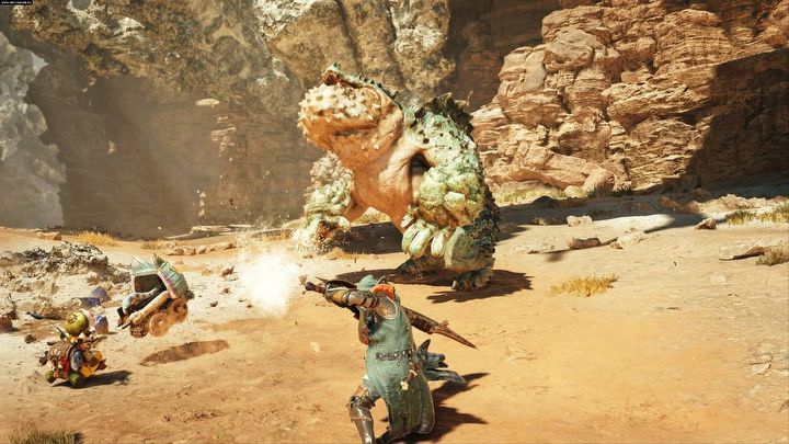
I played a section of which fragments you may have already seen online – it starts with a chase through the desert, during which we try to get away from "worms". At this stage, I thought that something had clearly gone wrong, that it shouldn't look this bad in 2024. The desert is empty, ugly, nothing is happening in the background, sand is just a texture tinted yellow, and to make matters worse – despite so few polygons displayed on the screen – it is disgustingly blurry.
I played on PS5 and I felt like someone has ported the game from Nintendo Switch. Framerate... Fans are wondering whether Monster Hunter: Wilds will run at 60 frames on consoles. Ladies and gentlemen - this demo had a problem with maintaining stable 30 frames. Falling chunks of rock also didn't look good - dust and particle effects are from a previous era. If the glitches in the graphics in Final Fantasy VII Rebirth on PS5 irritated you, then here... here it's about three or four times worse.
The colors are faded and burnt out. I've seen trailers from later stages and I'm glad that apparently it won't always look as if we were watching a retrospective of someone's funeral. So why was this particular stage chosen to present the gameplay to the press and players who came to the gamescom? Who in their right mind thought it was a good idea to make a fragment that seems to suggest that it was designed LONG before Monster Hunter: World was released playable? And Monster Hunter: World was released in 2018...
After all, Capcom had everything they needed - experience, people, money. They know how to make good games. Monster Hunter: World looked great, in fact, it still looks very good. So where did the idea come from to reduce the 2018 graphics to a level that simply, forgive me fans, repels?
Okay, it's ugly, but is it cool?
Yes, it's cool because it is Monster Hunter, and anyone who has ever played the series, will immediately be hooked on tracking down and killing huge monsters, exploring, gathering materials, and crafting new equipment. The combat evokes a similar feeling to that of MHW from 2018; we feel this "heaviness" and we immediately know that we will have to play it for many hours to master the combos and dynamics of a given weapon, and there are 14 types of them in the game.
I didn't have the opportunity to test the open world, but I believe that this aspect will not be a letdown. This is Monster Hunter after all – it has to have large maps with different biomes, huge monsters, and amazing fauna and flora. In the released demo I was able to fight one of the representatives of the huge beasts and what can I say – it's good old Monster Hunter.
Other positives include the character models that look good, or even better than that. This series has a specific style that it has stuck to for years, and which I absolutely love – and everything indicates that we will once again see over-the-top, highly detailed armor sets and weapons. It would simply be much better if the graphics were better.
Maybe... maybe it's just a matter of the game's old build, or maybe the very beginning was designed so that only the most die-hard fans could endure it... The new trailer from gamescom has been much more pleasing to the eye, so I hope that I will be positively surprised after the release. However, I currently remain distrustful, even discouraged. I won't spend money on a game in 2024... oh sorry, in 2025, that looks this bad. No, the graphics are not everything, of course - but even the simplest graphics should not be off-putting. Let it be a mistake, let it be a grim joke - but don't let the game look like this at the release, because this series will be doomed.


