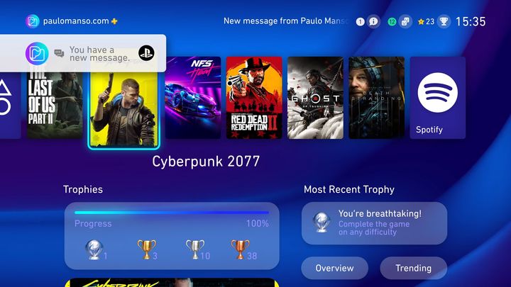
Fan Propositions for PS5's Interface
PlayStation fans are presenting a variety of ideas and concepts for what PS5's interface may look like. Some of the proposals give the impression of almost ready-made solutions that could easily be implemented by Sony.
4

Although we know that PlayStation 5 is due to debut at the end of this year, we still don't have much information about the platform. Fans are forced to speculate on the appearance and other aspects of PS5. The interface is also the subject of this type of consideration - several users have presented their visions of the console's UI on the Internet.
Perhaps the most interesting of these is Paulo Manso's idea - it features a modern, elegant interface that's not too far removed from what we know from PlayStation 4. Another solid plus is the fact that this user's proposed UI operates in 60 frames per second, and this smoothness is evident.
A bit similar, but in my opinion less attractive is the UI designed by the Internet user known as the Hacker 34.
On VR4Player.fr you'll find a video showing a concept that combines simple, neat icons (slightly reminiscent of the times of XrossMediaBar on PlayStation 3) with a game preview in the form of a kind of carousel to make browsing your library a little more enjoyable.
User Twoj bets maximum simplicity and proposes a design that resembles the look of some streaming services.
Similarly, ecnivtwelve's idea is similarly minimalist - the interface here is built around games.
Minimalism also characterizes John Calkins' proposals. The author presented several visions and presented them in a slightly more attractive form.
- PlayStation 6 with a drive after all? Leaks give hope that Sony will not make the same mistake as with PS5 Pro
- 60 fps in 4K and using ray tracing on PlayStation 6. Latest leaks suggest powerful processing power of Sony's new console
- PS5 got new update. Connecting DualSense controller to smartphone will take 3 seconds
4
Latest News
- 12 million players are celebrating, but not everyone will get a gift. ARC Raiders devs give away pickaxes and bans
- Cyberpunk 2077 creator explains why male V suddenly disappeared from ads
- Court sides with GTA 6 devs. Former Rockstar Games employees suffer a painful blow in their fight for money
- 2 Xbox Game Pass games. Star Wars: Outlaws comes with a newly released zombie apocalypse simulator
- „Bloodborne is a special game for me.” Dark Souls father's honest declaration is painful and hopeless, but true

