This Minor Change Could Make or Break Your Diablo 4 Experience
Blizzard listened to players and made a minor change to the game's interface. It's just a shame that some fans preferred the beta test version.

Last week, Blizzard Entertainment discussed how it intends to improve Diablo IV based on the experience of the (first) open beta. More (not only on this topic) was revealed during a recent broadcast. As it turns out, some fans are not thrilled with a certain change announced by the developers.
Problematic font
Among the objections to the test version of Diablo 4 there were quite a few concerning gameplay or classes, but players also had comments about the font.
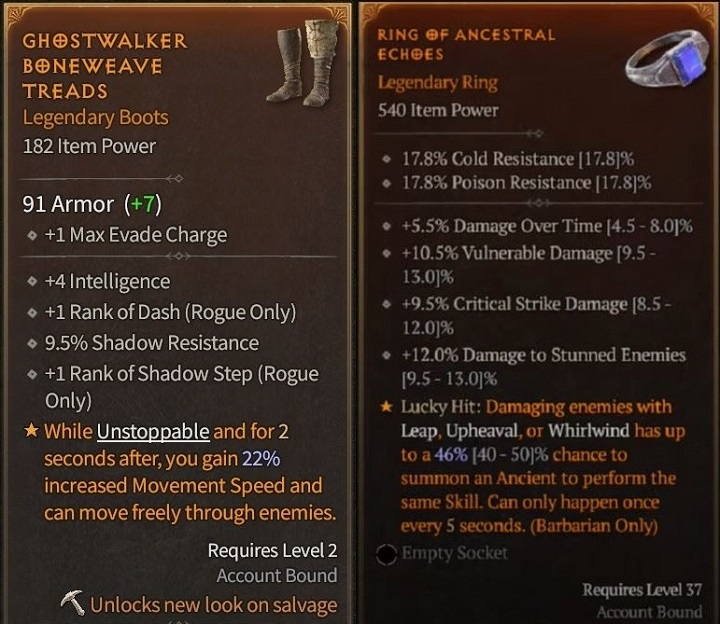
- This is because Blizzard used a "sterile", sans-serif font, which the players calaim does ot fit in with the dark fantasy setting. Some Internet users associate it with browser pop-ups or budget free-to-play games.
- So Blizzard went out of its way to meet player expectations and introduced a more "ornate" font. Of course, as is often the case, the change suggested by fans was coldly received by other fans of Diablo.

In fairness, let's mention that already in earlier discussions on this topic there were opinions that the font from the beta tests is better in one respect: legibility.
Serif type is widely considered to be less legible (especially on a device screen and for people with dyslexia). That's why in 2007 Microsoft abandoned Times New Roman in favor of Calibri (which, with a long delay, was also introduced by the US State Department).
The conflict of legibility and "immersiveness"
Therefore, in addition to fans who appreciate the new version of the interface for its "thematic compatibility" with Diablo 4 there is also no shortage of people complaining about its readability.
- Instead, some Internet users point out that the comparison posted on Reddit (above) is heavily skewed. The graphics with the new version of the UI are not only of much lower quality, but also show more text.
- Still other players are not thrilled with either version of the interface, considering them to be unreadable walls of text (on top of that using not one, but several fonts at once). In their opinion, Blizzard should follow the example of fans who showed their own ideas for improvements, going beyond font changes. Not that the players didn't have their fair share of comments about these proposals as well (mostly about missing information).
- Fans suggest also that Blizzard choose an intermediate, "semi-serif" option (which, knowing life, won't satisfy anyone). Or simply release both as separate options, just as was done with font size.
It is doubtful that either of these solutions will be included in Diablo 4 for the game's June 6 release. Perhaps Blizzard will consider changes after the debut. Until then, the community is likely to remain divided between supporters of readable and "immersive" fonts.
More for You:
0

Author: Jacob Blazewicz
Graduated with a master's degree in Polish Studies from the University of Warsaw with a thesis dedicated to this very subject. Started his adventure with gamepressure.com in 2015, writing in the Newsroom and later also in the film and technology sections (also contributed to the Encyclopedia). Interested in video games (and not only video games) for years. He began with platform games and, to this day, remains a big fan of them (including Metroidvania). Also shows interest in card games (including paper), fighting games, soulslikes, and basically everything about games as such. Marvels at pixelated characters from games dating back to the time of the Game Boy (if not older).
Latest News
- „They get more hate than they deserve.” Josef Fares comes to EA's defense and points the finger at Sony and Nintendo
- They used to ban them, now they make money on them. Rockstar opens Cfx Marketplace with paid and free mods
- „I don't get you guys”. New Tower mode in Diablo 4 divides players
- Euphoria didn't last long. „New” footprint of Prince of Persia: Sands of Time Remake turned out to be a painful return to the past
- „It's crazy that 50% of you are lying.” GTA 6 fans faced a tough choice: half would do it without hesitation


