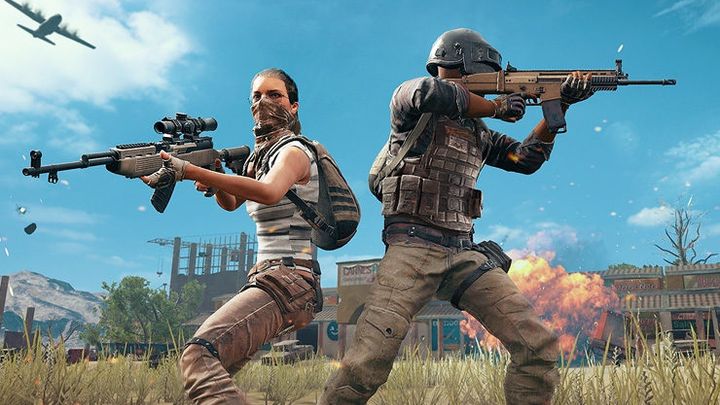
Check graphics comparison of PUBG, PUBG Lite and PUBG Mobile
Interesting video material appeared on YouTube that presents graphical comparison of individual releases of the battle royale hit from PUBG Corp. - Playerunknown's Battlegrounds.
2

Interesting video content appeared on RiXnZ YouTube channel that reviews the differences in graphic design in different versions of Playerunknown's Battlegrounds - ordinary, Lite (called here Project Thai) and Mobile. What exactly did PUBG Corp. programmers have to sacrifice in order to enable their game to work on particular configurations and types of hardware?
The changes are very clear - in fact, only in the case of the dedicated version of Steam you can talk about some kind of realism. In the Lite and Mobile releases, reduced lighting system combined with a more vivid palette of colors make the style of the game a bit more comic (this is the clearest in the case of the smartphone version). Ports dedicated to weaker platforms also offer noticeably angular geometry of the world, poorer water quality, much less sharp textures and a much limited view distance.
The basic edition of Playerunknown's Battlegrounds left Steam's early access program at the end of 2017. Last year, ports for consoles (available on PlayStation 4 and Xbox One) and mobile devices (so far only in beta version) also made their debut. We learned about the free PUBG Lite last week. The game is currently being tested in Thailand and it is unknown when it will go to Europe.
2
Latest News
- 12 million players are celebrating, but not everyone will get a gift. ARC Raiders devs give away pickaxes and bans
- Cyberpunk 2077 creator explains why male V suddenly disappeared from ads
- Court sides with GTA 6 devs. Former Rockstar Games employees suffer a painful blow in their fight for money
- 2 Xbox Game Pass games. Star Wars: Outlaws comes with a newly released zombie apocalypse simulator
- „Bloodborne is a special game for me.” Dark Souls father's honest declaration is painful and hopeless, but true


