Why is Geralt's medallion flat? Platige Image's Michal Niewiara about the Witcher from Netflix
How much of the witcher in The Witcher from Netflix? We can't answer this question just yet, but we've learned answers to a few others in a conversation with an employee of Platige Image, who designed the medallion of Henry Cavill's Geralt.

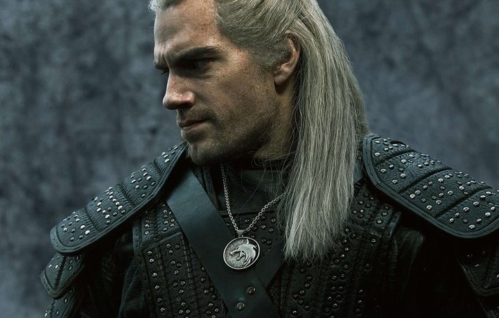
Only a few days separate us from the world premiere of The Witcher on Netflix, and there’s no denying that the tension is rising with every passing hour. The creators of the series face a huge crowd of fans, who have been criticizing almost every aspect of the show for several months – starting from the cast and ending with small props. Even such trifles as Geralt's medallion were disapproved by some ultra-fans.
It became the starting point for our conversation with Michal Niewiara, an employee of Platige Image, who was responsible for designing The Witcher symbol. Yes, the famous pendant was created in Poland, and was designed by a huge fan of the video games developed by CD Projekt Red. The artist believes that the in-game medallion has an elegant and stylish design.

Right now, Michal works as a director in Platige Image, but he was focused on completely different tasks for a long time. As he claims, he primarily was a lore consultant during the production of the series. Niewiara knows the books almost by heart – if he needs to check something, he knows exactly what chapters to look in. It’s not hugely surprising that Netflix decided to search for a lore expert in Poland, though. Having such an expert is a real treasure, in any case.
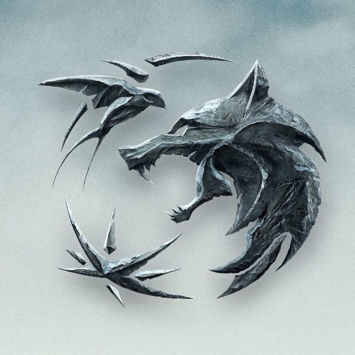
Our interviewee has received a proposal of designing various visual pieces for the new series: a logotype, the Witcher's medallion, maps. Michal admits that designing a convincing symbol, which would give the series a proper identity, was the most time-consuming task. In total, it took him several weeks to refine it:
I studied many sculptures to learn how to present logo elements in the best possible synthesis. At first it was very clean, not so bruised and rough, but then we changed our tactics. I was aware of the fact that I had to create something more legible, and Art Deco sculptures helped me a lot in achieving this. While designing such signs, you have to start with a flat shape – a sort of black-and-white stamp which still has to be filled. Once it worked, I had to think about how to show the rest; how to keep the dynamics of the shape or develop it further. Sometimes I even made clay models to test how a particular surface looks.
Michal Niewiara, Platige Image
One thing is certain – without the direct feedback from Lauren S. Hissrich, the logo wouldn't look that good. It was the showrunner herself who came up with the idea of making the logo's appearance more bruised and metallic. "As a result of this effort, the final project has gained a unique character" – emphasized Michal Niewiara.

The official logo of the series consists of three key elements: a swallow, a wolf and a star. The first element is obviously the symbol of Ciri, the second of Geralt and the third one... of Yennefer. Focusing on the Witcher's trinity perfectly reflects the key message of the series' creators, who stated that we're not dealing with a single protagonist, but rather with three, equally important characters.
The second issue that we have discussed in detail was the aforementioned medallion. Michal pointed out that he hadn't spend so much time on it as on the logo. The round shape of the pendant was proposed by the team led by Andrew Laws, but the entire concept belonged to Niewiara. It was instantly decided that the head of the wolf should be depicted from profile. A front-oriented snout just wouldn't work in this case.
Besides, the medallion had to be round – this is how Andrzej Sapkowski described it in his first short story: "The stranger reached into the jerkin once more and pulled out a round medallion on a silver chain. It pictured the head of a wolf, baring its fangs." Simplicity was its main feature. "The Witchers are not dwarven jewelers", explains Niewiara. "The medallion was a practical item with a particular purpose, it had to fulfill a certain task." To inform about imminent threat and vibrate if magic was detected. It might as well be a simple sphere on a chain". However, from the point of view of an artist, it was necessary for this simple concept to present itself credibly enough on a TV screen: "The background is more rough than the wolf itself, mainly because one time the medallion is hidden under a jacket and another time it’s exposed. It wears off, rubs off, wipes off – it has some sort of durability, so it can't look like a new item. Silver is still a soft metal, and everything that looks old and worn out looks more interesting in the camera."
Interestingly, Michal likes Geralt's medallion used in video games – as he admits, he spent hundreds of hours with CD Projekt Red products: "I like it, but it's not like the one described in Sapkowski's books. Every medium has its own set of rules, so the video game version of the pendant has the full right to work. It's elegant and someone really did a great job to create it." Of course, it would be impossible to avoid any comparisons with video games, but the disfavor of medallion designed for the series seemed a bit harmful and unfair. The author clearly referred to the original source and it is difficult to blame him for having prepared it as he should have done. However, he didn't care too much about the negative opinions: "I didn't lose any sleep over it, because you can't satisfy everyone. If someone doesn't like it, then it's his opinion and I'll have to respect it.

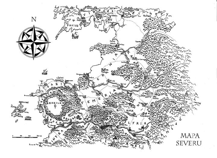
The last thing worth mentioning that Michal Niewiara has designed for The Witcher Netflix series was a new map. We will be able to check the maps in their full glory in new editions of The Witcher books, but until then we may notice some of their fragments on promotional content of the series. It is worth mentioning that Sapkowski has never truly cared about such things as the map, so all graphics designers are facing the same challenge. Michal has based his work on the Czech version of the map, because according to Andrzej Sapkowski, it is the most faithful one. Niewiara had to "bent it, stretch it and add necessary information if something didn't seem to be right.” It is worth noting that the new version of the map will also include the kingdom of Emblonia, that is, the region described by Sapkowski in the Season of Storms, the eight book, a prequel to the saga.
You will be able to rate Michal's efforts in just a week – on Friday (December 20, 2019), when the first season of The Witcher series will be released on the Netflix platform. Then we will finally find out whether the new interpretation of Sapkowski's saga remained faithful to the original, whether Henry Cavill managed to cope with the role, whether the black armor of Nilfgaard army looks well on the screen or... There are many questions, just hold on for a few more days.